Thursday, 28 January 2016

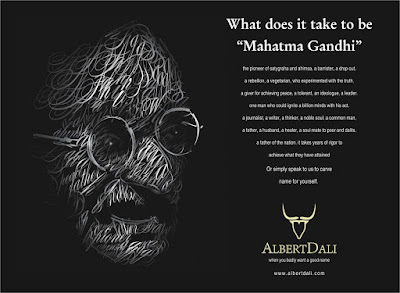
Ad with interesting layout and body copy -- Albert Dali

Image source: http://albertdali.blogspot.com
Type

The above ad is an ad by a naming consultancy based in India, Albert Dali. The firm provides brand names and trademarking for new companies or companies in need of rebranding.

Ad's appeal/Benefit of the ad

The ad features a prominent figure in India, using Mahatma Gandhi as a symbol of greatness and profound significance. The body copy explains the headline, "What does it take to be "Mahatma Gandhi"" and serves as a description of the essence of this very figure, describing him in a way that strongly highlights the many positive attributes of this well-known man. It ends with the statement, "It takes years of rigor to achieve what they have attained. Or simply speak to us to carve name for yourself". This shows that the firm provides brand naming to companies without leaving a single bit of effort for the companies to do so themselves.

What I like about the ad

All of the qualities in the body copy is carefully worded and it reads in an almost poetic way as it has good rhythm, as well as it is aligned in a paragraph shaped like the logo of the firm itself. The visual used is made up of the words in the body copy, further emphasising on the fact that these qualities are what make him remarkable in human history. The overall layout of the ad fits the elegant tone of the body copy and the ad as a whole is basically an example of what Albert Dali can do for companies when it comes to creating a name for them. The slogan of the company is a juxtaposed phrase -- "when you badly want a good name" -- which makes it catchy and memorable.

Unskippable YouTube Ad -- GEICO


Type

The above advertisement is an extended cut of a YouTube ad by GEICO, a Government Employees Insurance Company. The original ad is only up to the 10-second mark.

Ad's appeal/Benefit of the ad

The major problem in advertising on YouTube is that viewers have an option to skip advertisements ten seconds into it, so if an advertisement is not appealing enough, the core message of it is often ignored. This ad overcomes the problem, condensing the message into a simple family setting and one line uttered by one of the characters, "Don't thank me, thank the savings". The ad closes off with a voiceover saying "You can't skip this GEICO ad, because it's already over" and the tagline: "GEICO. 15 minutes could save you 15% more on car insurance". It is quick, supplying information without the usual dilly-dally.

What I like about the ad

The ad is in itself a smart way of putting the viewers' attention on the product/consumer benefit through its duration of 10 seconds. The teasing lilt in the voiceover as he says, "You can't skip this ad because it's already over" provides biting humour that leaves an impact on the viewers perception of the ad, making them feel tricked. Though that may not necessarily be a good thing, the ad is memorable as it evokes some kind of emotion from the viewers and generates response from them. (As shown by the likes/dislikes bar and comments on the extended cut of the video, many are upset by the ad but have chosen to view click on the ad to view the extended cut anyway.)

Others

There is a formula to make ads that are unskippable besides making it literally unskippable. The key is to gain attention from the get-go and retain it -- force the audience to spare their precious few seconds they intended to use on whatever video they are on and use them on the ad instead. Tapping into today's humour is relevant in any form of advertising and sometimes it is even advisable to make the ad unrelated to the product or service itself. The most difficult yet highly impactful of all is to make the ad go viral. On a platform such as YouTube, it is not impossible to gain such great exposure as YouTube is, essentially, a video platform that is used by millions of people worldwide.

(Source: http://mashable.com/2011/11/04/youtube-ad-campaign-tips/#gallery/8-ways-to-represent-your-small-business-on-youtube/50bdf0a15198407f800029ea)

Unique Commercial -- Tidy Cats LightWeight


Type

The above advertisement is a commercial for Purina Tidy Cats LightWeight, which is a cat litter that has continuous odour control, is powerfully absorbent and produces light, tight clumps for easy scooping. The ad was produced in partnership with Buzzfeed, a famous YouTube account with a worldwide following, hence the format of the ad itself follows the signature humourous and engaging formula in other typical Buzzfeed videos.

Ad's appeal/Benefit of ad

The ad opens with a voiceover, presumably from a cat's point of view, expressing the need to care for humans. Paired with the title "A Cat's Guide To Taking Care of Your Human", it immediately generates interest in an audience due to its unconventionality. Earlier on, the product advertised is shown in a subliminal way, not making an appearance through most of the ad except for the end where the voiceover introduces the ad as a good alternative compared to most heavy, leading clumping litter. This makes the viewers feel as if they are watching just another Buzzfeed video in all its lightheartedness and quirky humour, retaining their attention till the very end.

What I like about the ad

The overall ad appeals greatly to cat lovers and cat owners, the exact target audience for the product being advertised. The voiceover explains human behaviour as peculiar in relative to cat behaviour and puts the viewers in the cat's position instead of the human. The product tagline is mentioned ("All the strength, half the weight") and the cat's recommendation is further emphasised when the voiceover says, "Smart human". This provides a testimony towards the effectiveness of the product and guarantees convenience for humans and pets alike. It also indicates that users of the products are "smart" in choosing the product and that they are good cat-owners.

Others

According to the 12 Master Formats of Advertising, this ad utilises the exemplary story format. The ad itself does not make the product the focal point but at the end presents it as a solution to a problem faced by the owner through the cat's point of view. Apart from that, humour has been known to be the most effective way of getting a message across to an audience. This ad uses an unorthodox standpoint to illustrate its point, making it memorable to viewers.

Sources:

(http://tv4me.edublogs.org/12-master-formats-of-advertising/)

(http://www.forbes.com/sites/marketshare/2012/10/19/what-makes-a-tv-commercial-memorable-and-effective/#76df5ee11634)

Ad with interesting layout -- Heinz Seriously Good Pasta Sauce

Image credit: http://adsoftheworld.com/sites/default/files/styles/media_retina/public/images/heinz-seriously-good-1.jpg?itok=UlTlI1Uf

Type/Benefit of the ad

The above ad is a print ad made for Heinz Seriously Good Pasta Sauce, containing very few words yet arranged in an interesting layout. The product benefit is the juiciness of the pasta sauce, as it is made from natural fresh ingredients as Heinz is well-known for in their product range.

Ad's appeal

The ad appeals to the audience mainly through its vibrant colours and design. The words "We've made Seriously Juicy" is in a clear and bold font that is easy to read, surrounded by images of red tomatoes and kitchen utensils. Together, they are arranged in the shape of a tomato straight out of the Heinz bottle, with the caption, "Seriously good".

What I like about the ad

The ad is straight-to-the-point, directly focusing on the product's unique selling proposition (i.e: "seriously juicy"). The colours and images used are bright and eye-catching, blending well with the "fresh" quality in Heinz products. There is plenty of white space for the ad to not overwhelm viewers and the layout of the body copy and the images is creative and unordinary.

Others

The usage of colours is important in an ad as it impacts the way viewers feel when they view the ad. In this ad, the colour red is effectively used to gain attention as well as align with the recurring "fresh" theme of Heinz products. Had they used any other colour, the ad would have not met its objective in appealing to the audience.

(Source: https://www.blurgroup.com/blogs/group/the-impact-of-colour-in-advertising-marketing-and-design/)

Ad with interesting body copy -- Continental Airlines

Image credit: https://blogger.googleusercontent.com/img/b/R29vZ2xl/AVvXsEjfV1igJOJJ1DoqshjJGCtWr40EM42W7uqO_gbPA0YnkFC0WQcmK2UAOPecwS8GYODWQw9Kc9HVwOAxXSYQxc0gGEfziyfkZuzeKqpdR49mDiZcHjCCrcIBlANevGFxhCY-yEbX3Q_Nyn7g/s1600/CONTINENTAL+ad2.jpg


Type

The above advertisement is a print ad by Continental Airlines. It serves to promote the airlines and its benefits by emphasising on its lighthearted yet fully-committed flight services.

Ad's appeal/Benefit of the ad

The appeal of the ad mostly lies in its body copy. The tone used in the body copy is intimate, casual and ensures reliability. The headline is effective in a way that it inspires curiosity with the words "You can be late, but we can't", and upon closer inspection, viewers are able to read the full message of the headline, "You can be late (at the gate) but we can't (on our "dates")." The body copy then goes on to mention the "light, fun and care-free" flight experience whilst reassuring the viewers that they take their services seriously by being "professional and on time". Through their wording, they are able to convey the consumer benefits effectively and persuasively.

What I like about the ad

The body copy is written in such a way that makes you feel right at home, immediately establishing an intimate feel between the ad and the viewers. By coyly terming their interaction with their customers as "dates" and placing the focus on their customers to "feel good", it excels in presenting Continental Airlines as a brand name that cares, making that their unique value proposition compared to other airlines. The slogan "Work Hard, Fly Right" also contributes to its image and further reinforces the original message of the ad.

Others

According to the 10 Commandments of Great Copywriting, a good ad recognises its target audience and captures their attention through an interesting body copy with a clear unique selling proposition, as well as eases the viewers to read and digest the core message. This ad manages to first catch viewers' attention through the main headline and then reveals a deeper message in between the wording to emphasis on its main point. The body copy is clean and concise, presenting the consumer benefits in a simple and conversational yet reassuring way.

(Source: http://www.entrepreneur.com/article/164812)

Wednesday, 27 January 2016

12 Gunns Formats -- Clash of Clans Super Bowl TV Commercial


Type

The above advertisement is a Super Bowl TV commercial for Clash of Clans, a mobile MMO strategy game. The ad features Liam Neeson, an Irish actor who is well-known for his role in the action movie Taken. It also acts as a parody of one of his scenes in that same movie.

Ad's appeal

The main appeal of the ad is the ongoing celebrity featured in it. Liam Neeson is best known for playing roles in action movies, so it is only suitable that he should be a prominent figure in promoting action-packed games such as Clash of Clans. Fans of Neeson, or even those who recognise him from his various roles are drawn to watch the ad simply because he is the major character in it. The format of the ad being a parody adds to the effectiveness of the ad in grabbing and retaining the audience's attention as most are familiar with Neeson's iconic Taken phone speech.

What I like about the ad/Benefit of the ad

The ad has good cinematographic quality and effective humour, two elements that are common in Super Bowl commercials. The ad starts off with gameplay in the Clash of Clans app, which is later revealed to have been played by Liam Neeson himself. Apart from the obvious parody, the ad showcases the game as one that is so addictive and entertaining that even famous actors like Neeson take it seriously. This creates associated user imagery -- avid players of the game can relate to Neeson (or rather, AngryNeeson52) and it calls to aspirational non-players to experience the game for themselves in order to be more like him.

Others

According to the 12 Master Formats of Advertising, this ad is collectively three of the twelve types together in one -- it features an ongoing celebrity that helps people associate the character with the brand; parodies a well-known scene from a movie of the same genre and utilises associated user imagery by equating players of the game to action movie actors. This creates an entertaining and effective ad that will be sure to attract Super Bowl fans or viewers to play the game or at least give it a try.  

AIDCA concept -- Karstadt Quelle: Dental Insurance

Image credit: http://adage.com/images/random/bowling051007big.jpg

Type/Benefit of the ad

The above advertisement is an ambient marketing ad for a European dental insurance company named Karstadt Quelle. Ambient advertising utilises places one would not normally see an ad -- in this case, the ad is placed over a bowling alley, creating an illusion where the bowling pins are teeth in enormous mouths. The obvious benefit is that the agency provides insurance for dental care, regardless of whether or not they are bowling-related.

Ad's appeal

The ad captures attention -- any patron of the bowling alley would be able to see and take note of the design of the ad. The ad serves its purpose in a very in-your-face sort of way, forcing viewers to look at it with curiosity and in turn, resulting in generating interest. The headline is a direct headline that straight away presents the benefit, possibly arousing desire in the viewers as it appeals to their need for coverage of cost of dental care. By placing the contact details below the headline, it ensures commitment from the audience as they are automatically presented with means of communication with company in regards to their services, which in turn will create action.

What I like about the ad

As mentioned, the ad captures attention in a very effective way as it forces the audience to look at it through its assertive and bold visuals. The above ad gives the bowling players a new feel to their game as they score points to win by knocking out the "teeth". As a result, this ad presents itself in a rather humorous and entertaining way despite the frankness of the body copy.

Others

Ambient advertising has always been successful in creating interest due to its unusualness -- ads that blend in our surroundings make us stop and stare compared to the conventional methods such as print, radio and television advertising. However, the above advertisement may work better had they included consumer benefits which would present the company as one that provides for their customers' health (specifically dental health). This reinforces the Desire component of the AIDCA model more effectively as it addresses the consumer's needs and wants, therefore being more persuasive through its rational or emotional appeal.

Ad with good headline -- Boca Maldita Beer Ad

Image credit: http://adsoftheworld.com/media/print/boca_maldita_beer_instagram

Type/Benefit of the ad

The above advertisement is an ad made for Boca Maldita Beer. The selling point featured is that it has high content of alcohol, enough to "make you forget". This ad is a part of a series released by the company with an apparent theme -- the downfalls that one might face in terms of using social media (Instagram, Facebook, Tinder, Whatsapp, etc.).

Ad's appeal

The ad is presented in a simplistic way that makes it easy for the audience to take in the message, and it includes an attention-grabbing headline. The headline makes the viewers picture a hypothetical real-life scenario that appeals to its target audience, mainly youths or middle-aged consumers that actively use social media.

In this particular ad, the focus is on Instagram, putting the viewer in a situation in which a problem arises (i.e: "Your boyfriend commented on his ex's photo on Instagram") and pushing forward the product as the solution through its sub-headline, "Some days you just want to forget", paired with an image of product itself and the alcohol content as a testimony to the strong effect of the drink.

What I like about the ad

The headline is very relevant to society in this modern era, thus creating somewhat of an emotional appeal to the audience. It drives the point home in a very effective way as it is straightforward -- the audience understands that if they are faced with a similar problem presented in the ad, they can turn to the product to help them through it. One can argue that it is unethical for a company to advocate drinking "to forget", thus indirectly promoting unhealthy behaviour to overcome everyday problems, but at the end of the day it does aim to accomplish the very goal of advertising -- to create action by persuading consumers to buy the product.

Others

This ad features a headline that inspires curiosity from the get-go, and the point is to give an indirect command for the audience to buy the product as a solution to their problems. However, the ad fails to emphasises on its uniqueness. There is no selling point that makes it different from other high-content alcoholic drinks. According to Clark (2006), a good headline should incorporate The Four U's approach: it has to be Useful to the reader, provide them with a sense of Urgency, convey that the main benefit is Unique and do it all in an Ultra-specific way.

(Source: http://www.copyblogger.com/writing-headlines-that-get-results/)